Recent Works
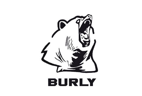
Burly Brand Logo
size variable
The Burly logo, inspired by an image of a bear, emphasizes this brand’s outdoor products. This logo is achieved by reducing the image into its basic structure while maintaining contrast and weight. Dark, thick lines provide emphasis and enable viewers to recognize the brand from far away. The natural rough edges allow for an organic edge. The Typeface Heisman is used for the geometric shapes and thick strokes which help the audience understand the genre of clothing.
Violet's Voice Studio Logo (Recently Updated)
size variable
A logo for a voice trainer in Delray, Florida. The soundbars form the letter V for Violet and Voice. The top of the soundbars is rounded while the bottom edges remain sharp to indicate the lifting bars. The same principle is applied to the typeface, Avante Garde Gothic Pro, a legible and sophisticated typeface that is easy to read and is used with the same stroke width as the soundbars.
Violet's website: www.violetsvoicestudio.com
DesignMap App
iPhone 12
Design map is a career app catering to design students and new graduates looking for careers. The futuristic elements are meant to inspire awe and promote self-improvement. The typeface JD Erica is used for its geometric nature and sharp edges that work cohesively with the overall concept of personal growth and refinement. The colorful design is intended to convey creativity.

Product Photography for Facesoft
3500 x 3000 pixels
Product images of Facesoft’s amazing towels. Photos were taken and then edited and optimized for Amazon. This company is all about promoting eco-friendly materials used in production. The towels are made from 100% cotton and avoid the use of any destructive microfibers that are found in so many competitor towels.

Book Cover Series
6 ¾ x 1 ¾ x 9 ¼ inches
Book cover trilogy inspired by Infernal Devices by Cassandra Clare that utilizes iconic elements from the actual book series. A unifying leather background texture references what is worn by the main characters while the chain represents a rustic necklace worn by the protagonist. Each title makes use of an icon as a visual substitution in the name. The chains begin to fade away on the front cover of each book as the main character reaches a state of self-awareness by the end of the series.

Fifty States of Vodka Social Media Campaign
1080 x 1080 pixels
An ad campaign for Simply The Best vodka brand using imagery created for each of the 50 states. Iowa uses corn because it is one of the country’s main sources of corn and their vodka is made from corn. Hawaii’s imagery refers to tropical cocktails. Illinois uses Chicago’s architecture to mimic the shape of the bottle.

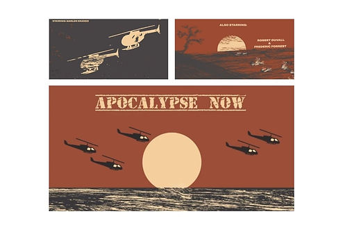
Apocalypse Now Title Sequence
1080 x 1920 pixels
The Apocalypse Now title sequence is reimagined with illustration. Solid blocks of color begin to deteriorate after the first frame, representing that both sides have already been defeated once a war is initiated. A consistent color scheme is used to maintain a cohesive look throughout the duration of the sequence. The audio perfectly matches the time period of the film. The Old Stamper typeface is used to reference types stenciled onto crates.
Experience the sequence: https://youtu.be/7-THa6o1kGs
Food Packaging for
Lekker Brand
seasoning: 3.625 x 5.5 inches
chutney: 4.25 x 4.25 x 4 inches
Packaging solutions for South African braai seasoning and chutney. Lekker means “that is good” in Afrikaans. The brand is inspired by the rich African culture and cuisine. Lekker means “That is good” in Afrikaans. The packaging features a deep blood orange to reflect the fiery African sunset. The ten-sided form for chutney is designed to stand out on the shelf while also providing a functional package.

Personalized Voice Mail
iPhone 12
This app allows the user to better manage and further edit the audio for their voice mail. The app achieves a calm look through the use of a cool color scheme. The user experiences an intuitive system that is easy to comprehend. The typefaces are Poppins, which is used in the logo, and Lato which is used for the rest of the text within the app. Lato is known for its curved edges, which flow nicely with the curved edges of the surrounding elements within each screen. Both typefaces are applied widely on a digital platform. The icon in the logo has notches inside that represent levels.
